4 tips to help you redesign your church website
 Let’s get real for a sec. Church websites are not exactly known for being well-designed or, you know, cool. Right?
Sometimes it looks like a church quickly threw together its website in 2004 because someone said it had to have one, and it hasn’t been updated since.
That’s not to say there aren’t some great church websites out there. There are.
But if you’re thinking about your church’s website right now and shaking your head with a grimace on your face, listen closely: you have to redesign that site now.
It’s not enough these days simply to have a website. We’ve all been on the Internet forever. We know what makes for a good website, and we know which websites are not worth our time.
If your website is hideous, or hard to navigate, or has outdated or incorrect information on it, it is not doing your church any favors. A good website will attract new members and make them feel like they’ve found the right place to worship. A bad website … won’t.
So with that in mind, here are four things to think about as you redesign your church website (plus a bonus tip!).
1. Clean, simple homepage
According to Thom S. Rainer, president and CEO of LifeWay Christian Resources, “as many as nine out of ten prospective guests will get their first impression of your church based on what they see when they go to the church website.”
For most of your visitors, that first impression will be made by the homepage of your site. This is why it needs to be great.
So what makes a homepage great? Well, it’s easier to talk about what makes a homepage terrible. And those things are:
Too many words
We humans are visual creatures, and although words are obviously important, a giant block of them on your homepage can make people want to click away from your site.
Start with a simple headline in a large, easy-to-read font works nicely. Try something friendly, such as, “You’ll find our doors are always open at First Church of God.”
You can also briefly mention your church’s core belief/s, days of worship, and contact info for your church The key word here is brief, because you can go into detail on subsequent pages.
Bad pictures
Your homepage should definitely have an image, or a few images, on it. Unless those photos are tiny, or blurry or badly taken.
This is a first impression, remember? You want visitors to visualize themselves attending your church, and they can’t do that if they’re squinting at a blurry photo taken in the dark from a half-mile away.
Garish design
Whatever you do, keep the design simple. Stick to just a few colors. Make sure all writing is large enough to read, and in black. Avoid cutesy or fancy, difficult-to-read, scroll-y fonts. Definitely avoid Comic Sans, and thank me later.
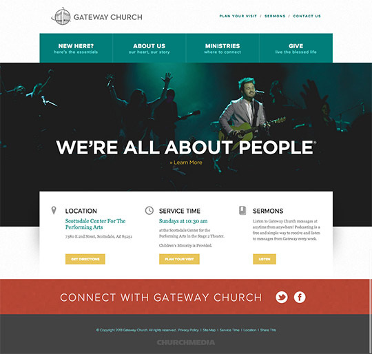
Check out the homepage of Gateway Church in Scottsdale, Arizona. It’s simple, clean and easy to navigate. A great homepage.
[caption id=”attachment_1014” align=”aligncenter” width=”540”] photo via churchrelevance.com[/caption]
2. Engaging 'About' page
You want visitors to know they’ve found a place where their beliefs are welcome and shared. An About page will let people know what your church’s beliefs and mission are.
It’s also a great place to include photos and brief bios of key teachers and leaders in your organization. Again, you want visitors to think, “Hey, I can see myself there,” and photos will help create a sense of familiarity.
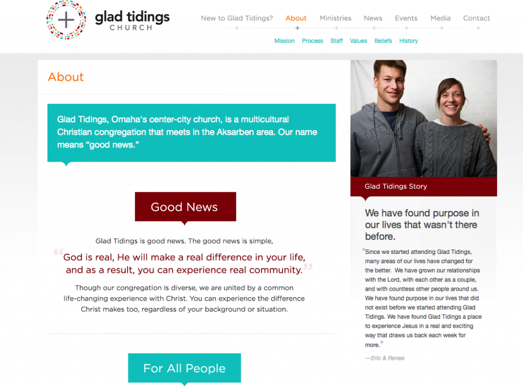
Check out the following About page from the Glad Tidings Church in Omaha, Nebraska. It is actually six pages: the general “about” info, mission, process, staff, values, beliefs, history.

Breaking up these elements makes the info engaging and easy to read. You want to click to the next page to see more. And did you notice the testimonials with photos from members on the side? Fantastic.
3. Easily found contact information
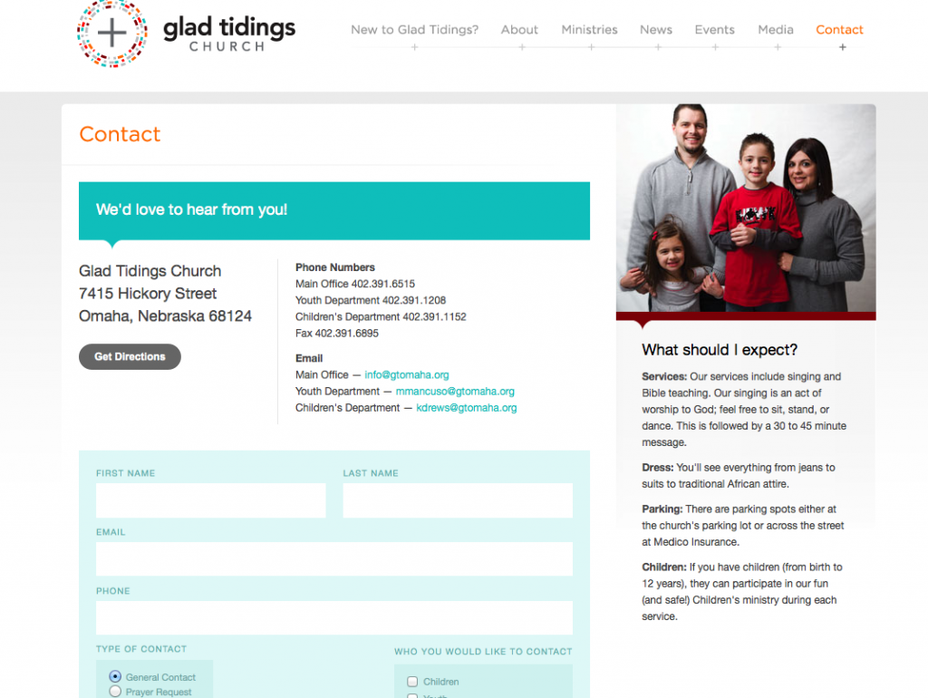
It is so important that visitors be able to find you easily. If they don’t know where you’re located, they can’t attend services with you, right? Therefore, you must make sure your address, phone number, and email information is easy to find on your website.
Earlier I said to include this info on the homepage, but it deserves its own page, as well. Why? So you can include more details, like directions to your church from major freeways, as well as a Google map to help show exactly where you are located.
Again, check out Good Tidings, which keeps its contact page tidy by using a button to take those who need directions to a separate page with a map.

4. Current worship services
Some visitors to your site just want to know when to show up for services, so it’s essential you include a page that tells them exactly when to do this.
You can also include times for group meetings, or Bible study sessions or special dinners — any event happening at your church.
Very important: If service times change, or if an event has already passed, you must update your site. Nothing says, “We don’t care how we look to you,” like outdated information on a website.
Bonus Tip: Mobile-friendly web design
These days, people are just as likely to be searching for your site on their phones and tablets as they are sitting in front of their home computers.
Therefore, your website has to be mobile-friendly, meaning it has to look good across all device platforms. All sites created with Buildicus are mobile-friendly, so you can focus on creating a great website and not on how that website will look on different screens.
In conclusion
Redesigning your church’s website is important, but please don’t make the mistake of thinking that once it’s redesigned, you won’t have to look at it again for years to come.
Websites should be constantly maintained and updated. Think of it this way: you don’t wash and comb your hair once a year, right? To look professional (and not scare people away), you regularly maintain your appearance.
So do the same for your church website, and you’ll be rewarded with happy visitors.


